最文档

Cypress移动端测试:响应式布局验证方案

   前言:移动优先时代的测试挑战
  在移动设备使用率超过桌面端的今天,响应式设计已成为现代Web开发的标配。然而,确保网站在各种屏幕尺寸下都能完美呈现却是一个巨大的挑战。传统的测试方法往往需要手动切换设备、反复刷新页面,效率低下且容易遗漏边缘情况。
  Cypress作为现代化的前端测试框架,提供了强大的 移动端测试能力,特别是其cy.viewport()命令,让响应式布局验证变得简单高效。本文将深入探讨如何利用Cypress进行全面的移动端响应式测试。
   核心能力:Cypress的视口控制
  viewport()命令详解
  Cypress的cy.viewport()命令是移动端测试的核心工具,它允许你动态调整测试浏览器的视口尺寸:
  // 设置特定尺寸
  cy.viewport(375, 812)  // iPhone X尺寸
   
  // 使用预设设备
  cy.viewport('iphone-6')
  cy.viewport('ipad-2')
  cy.viewport('macbook-15')
   
  // 方向控制
  cy.viewport('iphone-6', 'landscape')
   支持的预设设备
  Cypress内置了多种常见移动设备的预设:
   响应式布局测试策略
  1. 断点验证测试
  describe('响应式布局测试', () => {
    const breakpoints = [
      { name: '手机小屏', width: 320, height: 568 },
      { name: '手机标准', width: 375, height: 667 },
      { name: '手机大屏', width: 414, height: 896 },
      { name: '平板竖屏', width: 768, height: 1024 },
      { name: '平板横屏', width: 1024, height: 768 },
      { name: '桌面小屏', width: 1280, height: 800 },
      { name: '桌面标准', width: 1440, height: 900 }
    ]
   
    breakpoints.forEach(({ name, width, height }) => {
      it(`应在${name}(${width}x${height})下正常显示`, () => {
        cy.viewport(width, height)
        cy.visit('/')
        
        // 验证布局元素
        cy.get('.header').should('be.visible')
        cy.get('.navigation').should('have.css', 'display', 'flex')
        
        // 验证响应式类
        if (width < 768) {
          cy.get('body').should('have.class', 'mobile-view')
        } else {
          cy.get('body').should('have.class', 'desktop-view')
        }
      })
    })
  })
   2. 关键UI组件测试矩阵
  const testMatrix = [
    { device: 'iphone-6', orientation: 'portrait' },
    { device: 'iphone-6', orientation: 'landscape' },
    { device: 'ipad-2', orientation: 'portrait' },
    { device: 'ipad-2', orientation: 'landscape' },
    { device: 'macbook-15', orientation: 'portrait' }
  ]
   
  testMatrix.forEach(({ device, orientation }) => {
    describe(`${device} ${orientation} 测试`, () => {
      beforeEach(() => {
        cy.viewport(device, orientation)
        cy.visit('/')
      })
   
      it('导航菜单应正确显示', () => {
        cy.get('.nav-toggle').should(
          device.includes('iphone') ? 'be.visible' : 'not.exist'
        )
      })
   
      it('主要内容区域应适配', () => {
        cy.get('.main-content').should(($el) => {
          const width = $el.width()
          expect(width).to.be.within(300, Cypress.config('viewportWidth'))
        })
      })
    })
  })
   高级响应式测试技术
  视觉回归测试
  import { addMatchImageSnapshotCommand } from 'cypress-image-snapshot'
   
  addMatchImageSnapshotCommand()
   
  describe('视觉回归测试', () => {
    const devices = ['iphone-6', 'ipad-2', 'macbook-15']
    
    devices.forEach(device => {
      it(`应在${device}上保持视觉一致性`, () => {
        cy.viewport(device)
        cy.visit('/')
        cy.matchImageSnapshot(`homepage-${device}`)
      })
    })
  })
   交互测试与触摸模拟
  describe('移动端交互测试', () => {
    beforeEach(() => {
      cy.viewport('iphone-6')
      cy.visit('/')
    })
   
    it('应支持触摸滑动', () => {
      cy.get('.carousel')
        .trigger('touchstart', { touches: [{ clientX: 100, clientY: 100 }] })
        .trigger('touchmove', { touches: [{ clientX: 50, clientY: 100 }] })
        .trigger('touchend')
      
      cy.get('.carousel-item').first().should('not.be.visible')
    })
   
    it('应正确处理点击事件', () => {
      cy.get('.mobile-menu-button')
        .click({ force: true })  // 强制点击隐藏元素
        .should('have.attr', 'aria-expanded', 'true')
    })
  })
   实战:完整的响应式测试套件
  测试配置文件
  // cypress/config/mobile.config.js
  const { defineConfig } = require('cypress')
   
  module.exports = defineConfig({
    viewportWidth: 375,
    viewportHeight: 667,
    userAgent: 'Mozilla/5.0 (iPhone; CPU iPhone OS 13_2_3 like Mac OS X) AppleWebKit/605.1.15 (KHTML, like Gecko) Version/13.0.3 Mobile/15E148 Safari/604.1',
    e2e: {
      setupNodeEvents(on, config) {
        // 移动端特定配置
      }
    }
  })
   页面对象模型
  // cypress/support/mobile-pages.js
  class MobilePage {
    constructor() {
      this.navToggle = '.nav-toggle'
      this.mobileMenu = '.mobile-menu'
      this.mainContent = '.main-content'
    }
   
    visit() {
      cy.viewport('iphone-6')
      cy.visit('/')
      return this
    }
   
    openMenu() {
      cy.get(this.navToggle).click()
      cy.get(this.mobileMenu).should('be.visible')
      return this
    }
   
    verifyLayout() {
      cy.get(this.mainContent).should(($el) => {
        expect($el.width()).to.be.within(320, 414)
        expect($el.is(':visible')).to.be.true
      })
      return this
    }
  }
   
  export default MobilePage
   完整的测试用例
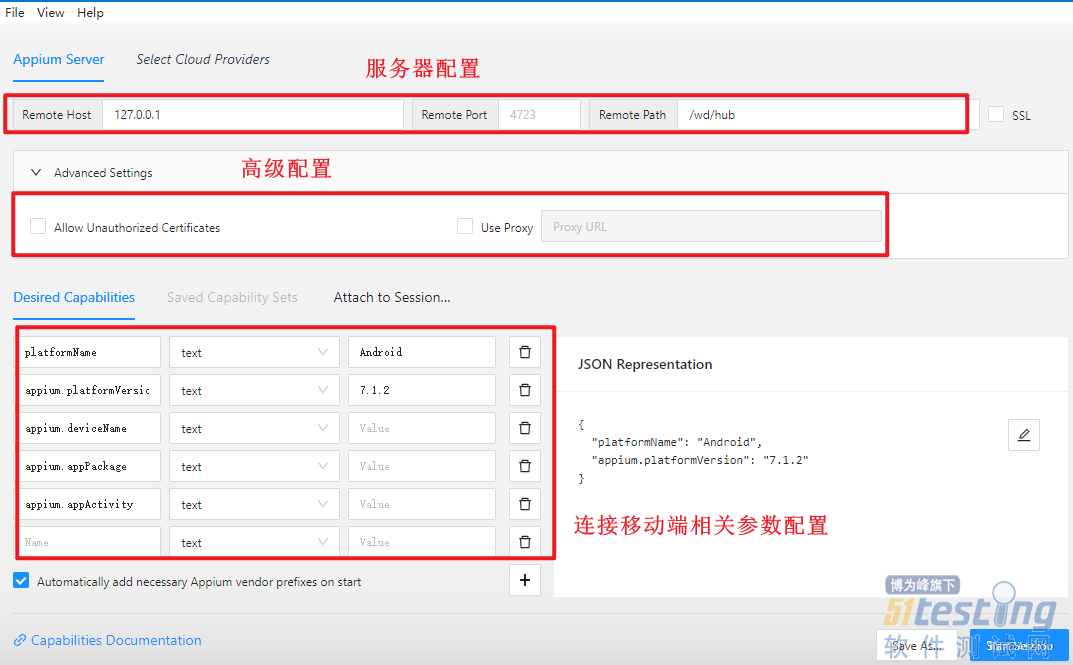
  // cypress/e2e/mobile/responsive.cy.js
  import MobilePage from '../../support/mobile-pages'
   
  describe('移动端响应式测试套件', () => {
    const mobilePage = new MobilePage()
   
    context('iPhone 6 竖屏测试', () => {
      beforeEach(() => {
        mobilePage.visit()
      })
   
      it('应正确显示移动端布局', () => {
        mobilePage.verifyLayout()
      })
   
      it('导航菜单应可交互', () => {
        mobilePage.openMenu()
        cy.get('.nav-item').first().click()
        cy.url().should('include', '/target-page')
      })
   
      it('表单元素应适配触摸操作', () => {
        cy.get('input[type="text"]')
          .type('测试输入', { force: true })
          .should('have.value', '测试输入')
        
        cy.get('select')
          .select('选项1', { force: true })
          .should('have.value', 'option1')
      })
    })
   
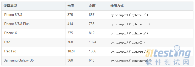
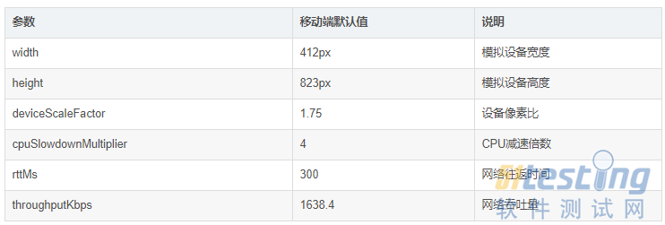
    context('多设备兼容性测试', () => {
      const devices = [
        { name: 'iPhone SE', width: 320, height: 568 },
        { name: 'iPhone 12 Pro', width: 390, height: 844 },
        { name: 'Samsung Galaxy', width: 360, height: 740 },
        { name: 'iPad Mini', width: 768, height: 1024 }
      ]
   
      devices.forEach(device => {
        it(`应在${device.name}上正常工作`, () => {
          cy.viewport(device.width, device.height)
          cy.visit('/')
          
          // 核心功能验证
          cy.get('.header').should('be.visible')
          cy.get('.content').should(($el) => {
            expect($el.width()).to.be.lessThan(device.width)
          })
          
          // 交互测试
          cy.get('button').first().click({ force: true })
          cy.get('.result').should('be.visible')
        })
      })
    })
  })
   最佳实践与性能优化
  1. 测试组织策略
  2. 并行测试配置
  // cypress.config.js
  module.exports = defineConfig({
    e2e: {
      experimentalRunAllSpecs: true,
      // 移动端专用配置
      mobile: {
        devices: [
          { name: 'iphone-6', width: 375, height: 667 },
          { name: 'ipad-2', width: 768, height: 1024 }
        ]
      }
    }
  })
   3. 智能等待策略
  // 移动端专用的等待策略
  Cypress.Commands.add('waitForMobileReady', () => {
    cy.window().should('have.property', 'mobileReady', true)
    cy.get('body').should('have.css', 'opacity', '1')
    cy.document().should((doc) => {
      expect(doc.readyState).to.equal('complete')
    })
  })
   
  // 使用示例
  beforeEach(() => {
    cy.viewport('iphone-6')
    cy.visit('/')
    cy.waitForMobileReady()
  })
   常见问题与解决方案
  问题1:触摸事件模拟不准确
   解决方案:
  // 自定义触摸命令
  Cypress.Commands.add('swipe', { prevSubject: 'element' }, (subject, direction) => {
    const touchStart = direction === 'left' ? 300 : 100
    const touchEnd = direction === 'left' ? 100 : 300
    
    cy.wrap(subject)
      .trigger('touchstart', { touches: [{ clientX: touchStart, clientY: 100 }] })
      .trigger('touchmove', { touches: [{ clientX: touchEnd, clientY: 100 }] })
      .trigger('touchend')
  })
   问题2:移动端加载性能差异
  解决方案:
  // 性能监控
  describe('移动端性能测试', () => {
    it('应在3秒内完成加载', () => {
      cy.viewport('iphone-6')
      cy.visit('/', {
        onBeforeLoad: (win) => {
          win.performance.mark('start')
        },
        onLoad: (win) => {
          win.performance.mark('end')
          win.performance.measure('loadTime', 'start', 'end')
        }
      })
      
      cy.window().then((win) => {
        const measure = win.performance.getEntriesByName('loadTime')[0]
        expect(measure.duration).to.be.lessThan(3000)
      })
    })
  })
   总结与展望
  Cypress提供了强大的移动端测试能力,通过cy.viewport()命令和丰富的API,我们可以构建全面的响应式布局验证方案。关键要点包括:
  1. 设备矩阵测试 - 覆盖主流移动设备尺寸和方向
  2. 交互模拟 - 精确模拟触摸手势和移动端交互
  3. 视觉回归 - 确保跨设备视觉一致性
  4. 性能监控 - 监控移动端特定的性能指标
  随着移动设备的不断演进,响应式测试的重要性只会增加。通过实施本文介绍的策略和最佳实践,你可以确保你的Web应用在所有设备上都能提供一致的用户体验。
   下一步行动建议:
   ·建立设备测试矩阵,覆盖你的目标用户群体
   · 实施视觉回归测试,防止布局回归
   · 监控移动端性能指标,优化用户体验
   · 定期更新测试策略,适应新的设备和浏览器特性
  通过系统化的移动端测试策略,你不仅可以提升产品质量,还能在竞争激烈的移动市场中保持优势。
   本文内容不用于商业目的,如涉及知识产权问题,请权利人联系51Testing小编(021-64471599-8017),我们将立即处理

本文链接:https://www.bdoc.cn/post/11.html

版权声明:本文内容不用于商业目的,如涉及知识产权问题,请权利人联系小编QQ或者微信:799549349,我们将立即处理

联系客服
返回顶部
Cypress移动端测试:响应式布局验证方案_APP测试_最文档

最文档